Our Vision
A work from the IEWT Design practice.
"Oral languages must always precede written languages
because the written words are merely the symbolic representation of the spoken words"
Although there are 2,500 different languages existing in the world, each shares a core value: communication. However, since many people are so obsessed with their own cultures and languages that they are missing the point of languages, the communication. If communication is lacking in a language, it’s not a language any more, but a meaningless sound. Since IEWT Design™ values humanism over technology, we want to be a friendly inspiration for people to be able to distinguish the essence of communication from the illusions and the false superiority of languages that often creates really useless fears in communication. IEWT Design™ design our humanism value by blending the alphabets/scripts of our neighborhood countries.
Thanks to the advanced technology of papers and computer storage system, we are living in a modern era where every single datum can be recorded and systemized under the authority of writing in different languages. Currently existing 2,500 divided languages have been playing a significant role in growing and fortifying current rules and policies. Thanks to the millions of new technology and new inventions appearing in this era, our English dictionary is only getting thicker and thicker. But is the thickness relevant to our happiness in communicating with each other? And further, with other nations?
Not long ago used my iPod touch, with its multilingual function, to test sensitivity in different languages in daily life. As I switched it from another language, it delivered a huge difference in feeling although it’s the same hardware. Following the belief that Japanese electronics are of high quality, when I changed my selection to Japanese, it made me feel like I owned a reliable gadget. In contrast, as I changed it to Mandarin, it made me feel as if my iPod touch looks relatively cheaper. Shocked to know that languages play such a huge role in our perception, I realized that I have a strong stereotype in Japanese and Chinese products. Through this simple test, I learned that languages can create false fears that block us from communicating with each other. I personally believe that a language is only a tool to deliver the essence, not the essence itself in true communication.
After studying abroad in four different countries for 15 years, I’ve realized that the ultimate goal of language is simply to communicate, but we often forget the truth because of our stereotypes and illusions of languages. If human beings become extinct one day, the existing languages will become obsolete. I believe languages only exist for our drama as a part of linguistic technology. When people live in an illusion of superiority of languages, they often fail to truly communicate with other language speakers because of the stereotypes they have each other. I believe the language shouldn’t be considered more or less important than its original role and purpose: a tool to communicate.
In the field of graphic communication, the legendary graphic designer Paul Rand attempted to unite letters, searching for unique graphic ways of putting them together. With his great understanding of visual andtechnical concepts such as typography and layout, he produced numerous successfully communicable designs adapting easiness and simplicity, which is the most important part of communication. He is famous for designing the pictogram version of the IBM logo. For the Eye-Bee-M poster he made in 1981, he designed the “I” with a picture of “eye” and the “B” with a picture of “bee” and he left “M” untouched for people to recognize IBM’s original slab serif font.
[Figure 1: Eye-Bee-M logo by Paul Rand, 1981]
[Figure 2: Type Talks by Paul Rand, Fall 1989]
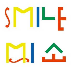
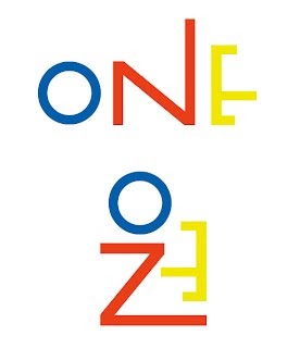
Paul Rand designed a related visually active typeface (Figure 2) by personalizing a phrase through the addition of talking lips. Paul Rand and other masters of typographic communication inspired me to attempt to unite two different languages so that people can obtain new perspectives on language and further realize the essence of languages beyond their form and sound. So far, I’ve combined only Korean and English as they have similar alphabet blocks. In Figure 3,4, I transformed English alphabet letters into Korean alphabet, hangeul , creating two words with the same meaning.
<Figure 3: Smile is 미소 by Jinwoo Park, 2010>
<Figure 4: One is 원 by Jinwoo Park, 2010>
My vision is to express my global typography to people so that we can distinguish the essence of the language from our stereotypes and illusions. Although it will start with a small snow ball, I believe it will eventually create a meaningful global movement. I strongly believe that my understanding in languages, global typography and design are a robust foundation for this project. Thanks to my global experiences, I have a unique perspective to look at typography of different languages. My goal is to unify languages in typography and to apply the results in different design areas. I hope that my attempt to unite alphabets in typography may bring positive relations between people and perhaps even between countries.
End Notes
Figure [1] "Paul-Rand.com :: IBM." Paul-Rand.com :: American Modernist :: 1914-1996. Web. 13 Sept. 2011. <http://www.paul-rand.com/site/ibm>.
Figure [2] "Paul-Rand.com :: Books & Articles :: Type Talks." Paul-Rand.com :: American Modernist :: 1914-1996. Web. 13 Sept. 2011. <http://www.paul-rand.com/site/books_typeTalks>.
Bibliography
Saltz, Ina. Typography Essentials: 100 Design Principles for Working with Type. Beverly, MA: Rockport, 2009. Print.
Blackcoffee Design (ed.), 1000 Icons, Symbols + Pictograms: Visual Communications for Every Language : 1,000 Works. Beverly, MA: Rockport, 2009. Print.
McCrum, Robert. Globish: How the English Language Became the World's Language. New York: W. W. Norton, 2011. Print.
Walker, Sue. Typography and Language in Everyday Life. Harlow: Longman, 2000. Print.